Sunday 26 October 2014

Newsstand task


Newsstand task.

In class, as preparation for my own music magazine, I was given a task to find newsstands which had music magazines. From doing so, we were instructed to analyse the distribution of magazines and how they are presented to the public in newsstand form but also in other various forms. For the research task, I went to WHSmiths and took a picture of the music magazines. In comparison to other stores, WHSmiths offered a large selection of music magazines as WHSmiths is a book shop. WHSmith provides the most notably popular magazines in the UK, although if a certain magazine isn’t available in the store, it is possible to subscribe to them or to request an issue be made available for you. Popular music magazines of all types of genres are available such as Rolling Stone, Uncut, Opera Now, Pianist, Mojo, Kerrang!, Q, NME, Computer Music, Guitarist, Beats Magazine, and more.

These were all positioned near the Photography magazines and the Motoring magazines. The magazines are all sorted out according to genre/interest.

The first thing I noticed when looking at the music magazine section was the mastheads of every magazine. By having all the mastheads visible allows the customers to be able to find their desired magazines but it also allows the customer to view the other magazines, allowing the magazine to promote itself and have increased sales and a larger audience.  Additionally, the skyline is visible with the majority of the magazines. The skyline gives an insight to the genre of the music magazine. For example, Mixmag's skyline is “The world's biggest  dance music & club culture magazine". From this, we can see that Mixmag is a magazine that is involved in club culture and dance, letting us know the genre of the magazine.

Despite having the skyline visible, the price of the magazine is not visible, as it is normally placed at the bottom of the front cover, next to the bar code. A possible reason for having the price at the bottom instead of at the top, where it is visible next to the masthead and skyline, is because the price can cause the customers not wanting to buy it, despite having content which appeals to them.

I noticed that the Hip hop magazines have bolder colour schemes on the cover, such as bright reds and bright yellows. In contrast, rock magazines such as Rock Sound and Kerrang! Have a lot going on their cover pages, such as skylines, images and loads of teasers and cover lines.

Software music magazines such as Future Music, Music Tech and Computer Music have no cover star, but have an image(s) of electronic software, computers and such. The music magazines either had an image of the instrument the magazine is dedicated to (i.e. guitar, piano, drums) whilst others have an image of a famous musician whose main instrument is that.

Teen magazines (for girls) have very crowded cover pages, with multiple images, bright colour schemes and usually offer free posters. Metal and hard-core magazines used a lot of black, grey/silver and red colours. The Rock magazines were in the middle/front at eye level, whereas the R&B and hip hop ones were further up/ at the back. The Instrument magazines were lowest on the news stand.

Distribution of Magazines:
There are many ways magazines distribute. One form that is the palm of our hands is applications on our phones. Many magazines currently distribute by using applications on their phone, including some or all the content in the hard copy of the magazine. These may be linked via a smart QR code on the front cover of the magazines. Distribution with apps can be beneficial to the customers, as some magazine apps are for free, such as Arpeggio magazine, allowing them to access a majority of the content featured in the magazine, for free.  The distribution of magazines with apps can also be beneficial for the publishers.

Another form of distribution is electronic brand extension.  Many magazines (such as Mixmag and Maverick) use social media as a way of extending their brand and creating an online presence. Similarly to magazine apps, the use of social networks such as Instagram, Twitter and Facebook. They may also extend into gigs and other events. This allows the magazine to gain a wider audience, as many people around the world use social networks. Social media has many benefits on the magazine, such as expanding editorial content. By using social media, magazines are able to understand the audience and cater to their interests. By doing so, the magazines are able to fulfil the needs of the audience and are able to create a stable audience, as the magazines follow their interests and the genre of music they enjoy.

Magazines can also be distributed by postal/ electronic subscription.  Readers who read the magazine on a regular basis, particularly niche publications, may consider subscribing to the magazine which appeals to them, allowing them to receive the magazine on a regular basis, usually at a heavily discounted price. This is easier for the audience as they receive the magazine straight to their homes, so there is a ease of access and copies are not wasted as a result. As there is a discount price, subscription saves money for customers instead of having to buy a new issue each time. Subscription only involves a single price whilst buying a new issue each time can be expensive.  Subscription also ensures a stable number of readers for the magazine, as they will receive the magazine weekly or monthly. It can also branch out to other cultures and places in the world. Electronic distribution works in a similar way, except the magazine will be delivered to the customer's inbox, Kindle Fire or IPad.  Similar to postal/electronic subscription, freemiums are the direct distribution of magazines. Magazines have started to become distributed-for free and this has become an increasingly popular method of magazine distribution as free issues are given out to members of the public on a daily basis. Freemiums are mostly distributed near bus/train stations and public areas.

Friday 24 October 2014

Prezi work!

Today i started to create a 'Prezi' presentation for my pitch about my music magazine. It was my first time using Prezi and i found it fairly easy as everything had identifiable logos for example a picture used to represent inserting photos.  

Sunday 19 October 2014

College Magazine Evaluation.

College magazine evaluation

In AS media I have been learning about the different conventions of magazines and what I need to include if I was to create my own magazine. As a consequence of learning this I had a task to create my own college magazine front cover and contents page.

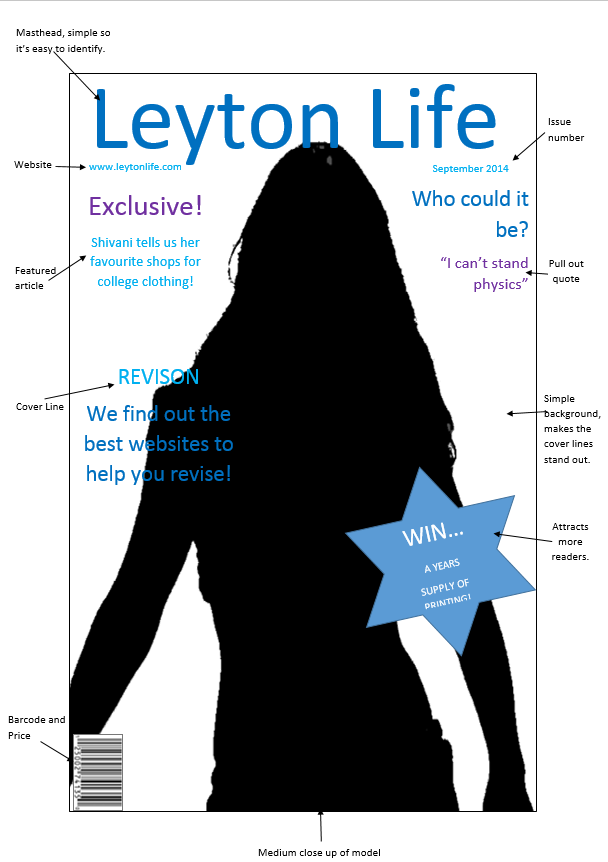
In preparation for my front cover I needed guidance so I created a plan for my magazine using Microsoft word, with this plan I annotated typical magazine conventions which I would be featuring in my own magazine for example: cover lines, colour scheme and issue date. Creating a plan helped me when creating my actual front cover because I already knew what I needed to include and all I had to do was put my ideas together.

To create my front cover I used Adobe Photoshop which I found challenging. This was because the main focus of my front cover was going to be my model, which had to be a student and I had the responsibility of taking the pictures myself, I found this hard because I couldn't find anywhere with a plain wall and good lighting, as a consequence of not finding good lighting the background of my magazine looks as if it has a red tone, I tried to minimise this by adjusting the brightness and saturation of the image however no matter what I done the image still had a red tone to it. In addition to this I had no previous experience of using Photoshop therefore I didn't know how to get rid of the red tone so I therefore had no choice but to adjust the brightness and saturation. Next I had to decide on a font for my masthead, cover lines etc. I found this quite easy as I had a vision already of a simple but bold font which was easy to read, reasons for this is so that it’s easy for the reader to identify the magazine and it makes cover lines more attractive because they don’t look too long or complicated. As well as choosing a font I had to pick a font colour which would make up a colour scheme for my magazine, I chose two shades of blue (electric and neon) for my masthead, cover lines and issue date and 2 shades of purple (neon and violet) for my main cover line about the featured student on the front cover. I chose a colour scheme to show that I have an element of organisation in my magazine but to also attract a loyal audience. I teamed up with a classmate and we both gave each other some feedback on what went well and what we needed to improve on, we both agreed that ‘the blue on beige background is easy on the eyes and the font is large and easy to read.’ However one thing I could do to improve my front cover is making the price of the magazine bigger so that (potential) readers know the magazine is free attracting a larger audience.

To create my contents page I had to use InDesign, however I didn't read the brief thoroughly and I created my contents page on Photoshop instead, which I found very tricky because Photoshop did not have the right tools for editing and positioning text. I carried on my colour scheme of different shades of blue (neon, electric and pale) this is because I wanted to give my magazine as a whole consistency and make it look organised. On the left side of my page I had a column including the contents of my magazine with 3 main headings (hot topic, news and limited). I done this to make it easier for readers to identify articles they are interested in reading but to also segment the different genres featured in my magazine. Also on the center left of my page I used a thin electric blue text box to create a small column page numbers for the articles on the left. I used a coloured text box to make it easier for readers to navigate through my magazine but to also create a break between the text on my contents page and the column of pictures on the right side of my contents page. The right hand side includes three pictures that are included in articles in the magazine and each picture includes a page number on the bottom right corner of the picture which attracts more readers to those specific articles because the reader may find the picture attractive. Also on the bottom right corner of my contents page I included a free lunch voucher this helps to attract a loyal audience as they will expect a freebie every month a new issue of the magazine in released. I found the journalistic part of the contents page fairly easy I had previous experience in making magazines and contents pages in general. However from audience feedback and my own opinion I feel that I could have made the font of the contents smaller and included more articles and linked them to the pictures on the right hand side of the page.


From this task I have come up with four main features I want to include in my music magazine. One being a consistent colour theme as it brings the whole magazine together. Secondly I would like to research ways to edit pictures in Photoshop so my front cover looks professional and has no faults to it. Thirdly i am going to do a lot of research in my specific music genre so I know what my target audience wants in the magazine so overall the content of my magazine is useful to my readers, and lastly I am going to create a plan of my front cover and contents page so that i don’t have to waste time about thinking of articles to include in my contents page.