Newsstand task.
In class, as preparation for my own music magazine, I was
given a task to find newsstands which had music magazines. From doing so, we
were instructed to analyse the distribution of magazines and how they are
presented to the public in newsstand form but also in other various forms. For
the research task, I went to WHSmiths and took a picture of the music
magazines. In comparison to other stores, WHSmiths offered a large selection of
music magazines as WHSmiths is a book shop. WHSmith provides the most notably
popular magazines in the UK, although if a certain magazine isn’t available in
the store, it is possible to subscribe to them or to request an issue be made
available for you. Popular music magazines of all types of genres are available
such as Rolling Stone, Uncut, Opera Now, Pianist, Mojo, Kerrang!, Q, NME,
Computer Music, Guitarist, Beats Magazine, and more.
These were all positioned near the Photography magazines and
the Motoring magazines. The magazines are all sorted out according to
genre/interest.
The first thing I noticed when looking at the music magazine
section was the mastheads of every magazine. By having all the mastheads
visible allows the customers to be able to find their desired magazines but it
also allows the customer to view the other magazines, allowing the magazine to
promote itself and have increased sales and a larger audience. Additionally, the skyline is visible with the
majority of the magazines. The skyline gives an insight to the genre of the
music magazine. For example, Mixmag's skyline is “The world's biggest dance music & club culture
magazine". From this, we can see that Mixmag is a magazine that is
involved in club culture and dance, letting us know the genre of the magazine.
Despite having the skyline visible, the price of the
magazine is not visible, as it is normally placed at the bottom of the front
cover, next to the bar code. A possible reason for having the price at the
bottom instead of at the top, where it is visible next to the masthead and
skyline, is because the price can cause the customers not wanting to buy it,
despite having content which appeals to them.
I noticed that the Hip hop magazines have bolder colour
schemes on the cover, such as bright reds and bright yellows. In contrast, rock
magazines such as Rock Sound and Kerrang! Have a lot going on their cover
pages, such as skylines, images and loads of teasers and cover lines.
Software music magazines such as Future Music, Music Tech
and Computer Music have no cover star, but have an image(s) of electronic
software, computers and such. The music magazines either had an image of the
instrument the magazine is dedicated to (i.e. guitar, piano, drums) whilst
others have an image of a famous musician whose main instrument is that.
Teen magazines (for girls) have very crowded cover pages,
with multiple images, bright colour schemes and usually offer free posters.
Metal and hard-core magazines used a lot of black, grey/silver and red colours.
The Rock magazines were in the middle/front at eye level, whereas the R&B
and hip hop ones were further up/ at the back. The Instrument magazines were
lowest on the news stand.
Distribution of Magazines:
There are many ways magazines distribute. One form that is
the palm of our hands is applications on our phones. Many magazines currently
distribute by using applications on their phone, including some or all the
content in the hard copy of the magazine. These may be linked via a smart QR
code on the front cover of the magazines. Distribution with apps can be
beneficial to the customers, as some magazine apps are for free, such as
Arpeggio magazine, allowing them to access a majority of the content featured
in the magazine, for free. The
distribution of magazines with apps can also be beneficial for the publishers.
Another form of distribution is electronic brand
extension. Many magazines (such as
Mixmag and Maverick) use social media as a way of extending their brand and
creating an online presence. Similarly to magazine apps, the use of social
networks such as Instagram, Twitter and Facebook. They may also extend into
gigs and other events. This allows the magazine to gain a wider audience, as
many people around the world use social networks. Social media has many
benefits on the magazine, such as expanding editorial content. By using social
media, magazines are able to understand the audience and cater to their
interests. By doing so, the magazines are able to fulfil the needs of the
audience and are able to create a stable audience, as the magazines follow
their interests and the genre of music they enjoy.
Magazines can also be distributed by postal/
electronic subscription. Readers who
read the magazine on a regular basis, particularly niche publications, may
consider subscribing to the magazine which appeals to them, allowing them to
receive the magazine on a regular basis, usually at a heavily discounted price.
This is easier for the audience as they receive the magazine straight to their
homes, so there is a ease of access and copies are not wasted as a result. As
there is a discount price, subscription saves money for customers instead of
having to buy a new issue each time. Subscription only involves a single price
whilst buying a new issue each time can be expensive. Subscription also ensures a stable number of
readers for the magazine, as they will receive the magazine weekly or monthly.
It can also branch out to other cultures and places in the world. Electronic
distribution works in a similar way, except the magazine will be delivered to
the customer's inbox, Kindle Fire or IPad.
Similar to postal/electronic subscription, freemiums are the direct
distribution of magazines. Magazines have started to become distributed-for
free and this has become an increasingly popular method of magazine
distribution as free issues are given out to members of the public on a daily
basis. Freemiums are mostly distributed near bus/train stations and public
areas.


 The front cover of DJ magazine includes a featured artist
(Magda). The front cover consists of an extreme close up of Magda, this is a
very close shot showing the physical features of a person to make the viewer
aware of some specific detail in her face. The lighting is focused on the artists
face, the light focused on her face may represent the popularity of Magda in
the dance music industry, attracting a large audience as the magazine features
popular artists. Her outfit consists of many buckles and straps, representing
Magda setting her own trend. Also her makeup is very bright and eye catching,
this draws the reader to her eyes, making the reader feel as though they are
part of the magazine. The font of the masthead is red with bold text used to
entice the readers also the font connotes youth and liveliness because of its
'bubble writing' look. The magazine logo includes the magazine website, this
states further information about the about the magazine and behind the scenes,
this tells readers that the magazine has a lot more to offer. The particular
main cover line relates to the backdrop of the magazine cover, because the font
of the main cover line is lime green just like the eye shadow on Magda's eyes,
showing that the image and the text link together due to it being colour
matched. Also the magazine seems to give more; the magazine includes a free
download card this gives the reader another reason to buy the magazine as they
are getting more for less. Cover lines are also used as another reason for a
reader to buy the magazine, there are 12 small cover lines on the front cover
with explanatory text underneath, usually the explanatory text is in a
different colour to the cover line but on this issue of DJ Mag it seems to be
the same colour, this could be a way of the magazine trying to put the focus on
Magda and her cover line. DJ Magazine seem to put the masthead in front of the
model no matter what the shot type is, making it easier to establish the
magazine, but also show that the magazine itself is more important than the
featured artist.
The front cover of DJ magazine includes a featured artist
(Magda). The front cover consists of an extreme close up of Magda, this is a
very close shot showing the physical features of a person to make the viewer
aware of some specific detail in her face. The lighting is focused on the artists
face, the light focused on her face may represent the popularity of Magda in
the dance music industry, attracting a large audience as the magazine features
popular artists. Her outfit consists of many buckles and straps, representing
Magda setting her own trend. Also her makeup is very bright and eye catching,
this draws the reader to her eyes, making the reader feel as though they are
part of the magazine. The font of the masthead is red with bold text used to
entice the readers also the font connotes youth and liveliness because of its
'bubble writing' look. The magazine logo includes the magazine website, this
states further information about the about the magazine and behind the scenes,
this tells readers that the magazine has a lot more to offer. The particular
main cover line relates to the backdrop of the magazine cover, because the font
of the main cover line is lime green just like the eye shadow on Magda's eyes,
showing that the image and the text link together due to it being colour
matched. Also the magazine seems to give more; the magazine includes a free
download card this gives the reader another reason to buy the magazine as they
are getting more for less. Cover lines are also used as another reason for a
reader to buy the magazine, there are 12 small cover lines on the front cover
with explanatory text underneath, usually the explanatory text is in a
different colour to the cover line but on this issue of DJ Mag it seems to be
the same colour, this could be a way of the magazine trying to put the focus on
Magda and her cover line. DJ Magazine seem to put the masthead in front of the
model no matter what the shot type is, making it easier to establish the
magazine, but also show that the magazine itself is more important than the
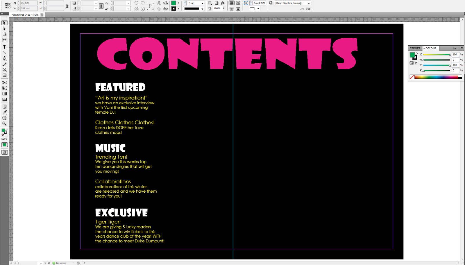
featured artist. There is only one page used for the contents page suggesting
that the magazine summarised what they thought was the most popular and
appealing articles. The contents page is split into 5 sections including:
features, comin' up, on the floor, music and tech. putting your articles in
sections makes it easier more readers to navigate. The contents page has been
organised into 2 columns making it easier to identify section names and
articles. Also the featured articles have been put into lime green text boxes
this carries on the colour scheme from the front cover making the reader feel
as if the magazine is organised well but also it makes the sections stand out
and it splits the articles up so they are not confusing to find. On the far
right of the page, there is a column filled with an arrangement of pictures,
with the respective page number displayed in one of the corners of the image.
There is also a masthead at the top of the page saying ‘Contents’, as well as a
small credit in the bottom left corner ‘Cover Pic: Dan Reid’, which is big
enough to be legible but not obscure the image of DJ gear that it overlaps
with. The masthead ‘contents’ doesn’t seem to stand out from the background as
the width of the font is small and the font colour is grey suggesting that the
magazine is trying to draw the reader’s attention to the cover lines which are
bright and colourful because they include text boxes.
There is only one page used for the contents page suggesting
that the magazine summarised what they thought was the most popular and
appealing articles. The contents page is split into 5 sections including:
features, comin' up, on the floor, music and tech. putting your articles in
sections makes it easier more readers to navigate. The contents page has been
organised into 2 columns making it easier to identify section names and
articles. Also the featured articles have been put into lime green text boxes
this carries on the colour scheme from the front cover making the reader feel
as if the magazine is organised well but also it makes the sections stand out
and it splits the articles up so they are not confusing to find. On the far
right of the page, there is a column filled with an arrangement of pictures,
with the respective page number displayed in one of the corners of the image.
There is also a masthead at the top of the page saying ‘Contents’, as well as a
small credit in the bottom left corner ‘Cover Pic: Dan Reid’, which is big
enough to be legible but not obscure the image of DJ gear that it overlaps
with. The masthead ‘contents’ doesn’t seem to stand out from the background as
the width of the font is small and the font colour is grey suggesting that the
magazine is trying to draw the reader’s attention to the cover lines which are
bright and colourful because they include text boxes. The double page spread is split into two sections, one page
is full of text and the other is a medium close up of the featured artist. Using
a medium close up helped the readers to get a close look at the model so much
so it created some intensity between the reader and the model because they
could establish his mood because of his facial expression. The lighting on the
left hand side of the model is very dull, readers can only see one side of his
face because of this creating an element of suspense and mystery. The font of
the masthead and rest of the article is very simple yet modern, making the
article look more attractive and ‘clean’ because of its simplicity. The article
is split into 3 columns, with bold text used only for the questions as it is an
interview article. Putting the questions in bold text makes it easier for the
reader to establish the questions from the answer and to make it easier to see
what questions interest them. The answers within the article are written in 1st
person as it is reported speech of the artist featured. The artist is wearing a
black t-shirt which is quite boring and dull, however behind the artist there
is a bright lime green pattern which has connotations of youth, refreshing and
envy.
The double page spread is split into two sections, one page
is full of text and the other is a medium close up of the featured artist. Using
a medium close up helped the readers to get a close look at the model so much
so it created some intensity between the reader and the model because they
could establish his mood because of his facial expression. The lighting on the
left hand side of the model is very dull, readers can only see one side of his
face because of this creating an element of suspense and mystery. The font of
the masthead and rest of the article is very simple yet modern, making the
article look more attractive and ‘clean’ because of its simplicity. The article
is split into 3 columns, with bold text used only for the questions as it is an
interview article. Putting the questions in bold text makes it easier for the
reader to establish the questions from the answer and to make it easier to see
what questions interest them. The answers within the article are written in 1st
person as it is reported speech of the artist featured. The artist is wearing a
black t-shirt which is quite boring and dull, however behind the artist there
is a bright lime green pattern which has connotations of youth, refreshing and
envy.  The front cover of Mixmag includes a image of a featured artist inside the magazine. The shot type of the artist 'Tiga' is a medium shot, this shows half of the body. This is when the shot is taken from above the head to just below the waist, this allows the audience to get to know the artist more closely by viewing their facial expressions and body language. The colours used on the front cover help attract its audience, this is because bright colours such as pink and blue are normally worn when going clubbing, therefore the colour scheme throughout the magazine and front cover matches the genre of music the magazine is aimed at (dance and club music). The lighting on Tiga's face is very dull as the hat he is wearing creates a shadow onto his eyes, this signifies an element of 'mystery' and makes the reader want to buy the magazine as they want to find out more. The baseball jacket Tiga is wearing looks as though it is silk, silk is a very expensive material therefore this must mean that Tiga has a lot of pride in his appearance just like the typical audience for the magazine, in addition to this baseball jackets are trending in fashion, this concludes Tiga keeps up with fashion trends as well as good quality clothing. Mixmag includes a list of other popular artists featured within the magazine, ensuring readers that they have their moneys worth of content inside, this signifies to the reader that the magazine has taken its time to carefully select important artists of the specific genre. The cover line 'PLUS' on the front of Mixmag shows that the magazine has more to offer. The font of the masthead is always the same however the colour varies according to its background, this makes it easy for a loyal audience to identify the magazine, but also it allows new readers to identify the name as the font is very simple. The sky line is used to promote the magazine as being 'the worlds biggest dance & club culture magazine'. The font of the skyline is very simplistic and white making it stand out well against the teal background. In addition to font, the baseball jacket Tiga is wearing is light pink which matches the font colour of all the cover lines and masthead, making the image and text coordinate nicely as its easily matched together.
  The format of the contents page is very clear as its has been split up into 5 sections (cue, features, fashion, tunes and directory) this makes is easy for the reader to navigate through the magazine, this is suitable for the target audience as adults do not like wasting time. "Contents" is clearly placed at the top of the page informing the reader that this is what the page is for, if it wasn't there it would be hard to tell that it is a contents page since contents page's are normally one page. Also the font used is bold and white and is written in a font similar to one that is used to promote night clubs on leaflets etc. This is an example of comparison and link of the genre of the magazine. Multiple sub images are used on the contents page to help make navigating easier as a reader. Each picture contains a page number with it as the picture represents an article in the magazine, the pictures include a famous musician or subject such as a girl clubbing or a wide shot of a concert audience making it easy for the reader to establish this. The images used are very bright against the black background making the reader notice the imaged articles rather then the sections provided. The contents page of Mixmag is a double page spread with columns ascending on either side, it is aligned in columns, making it easier for readers to locate content within. This could also signify that readers of Dance magazines are very organised and structured just like the layout of the magazine. Lastly there is a main colour scheme of black and white, this makes the magazine look more simple and music focused. The front cover mentions 'club culture, and the contents page reflects that since clubs are very dark just like the background of the contents page.


